The Nanvero identity.
Logo files, color, type and the rules that keep them coherent — for partners, press and agencies. Everything here is the same source the product is built from.
An engraved star chart, not a space app.
Three things to hold on to before you make anything. Get these right and the details mostly follow.
Thesis
Your travel is scattered points of light; Nanvero draws the lines until they form a constellation you can read.
World
An engraved celestial atlas — the tradition of the Bayer and Bode star charts — and deliberately not a dark space app. Warm ivory paper alternates with deep midnight sky. Product screens sit inside framed plates: the world frames the product, never invades it.
Register
Quietly confident, premium, trustworthy — Amex × Flighty × Notion, never crypto-startup. Intelligence is shown, not announced. The word “AI” does not appear in our marketing, and shouldn't appear in yours for us.
The constellation‑N.
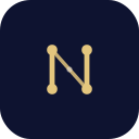
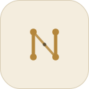
Two heavier parallel posts, a calmed diagonal, four corner stars and a quiet interior node. The N should read before the constellation does — that hierarchy is the point of the drawing. Click any file to download it.





Clear space
Clear space is the mark's own box. Its artwork measures 20.8 × 22.8 units inside a 32-unit box, so the file already carries 5.6 units of margin at the sides and 4.6 top and bottom — about a quarter of the mark's width. Keep that whole box empty and never crop it.
Dashed line: the clear-space boundary. Thin line: the artwork's actual bounds.Minimum size
Lockup: 90px / 25mm wide. Mark alone: 24px. At 24px and below, switch treatment rather than scaling down — the small drawing thickens the strokes, grows the stars and drops the interior node. Scaling the standard mark down loses its hairlines.
 1624406416 and 24 px use the small-size treatment; 40 and 64 px the standard mark.
Color.
Neutrals carry every surface; gilt is the only constant accent. Pick the gilt by its ground, not by taste — #C7A45C is too light to pass contrast on white at small sizes, which is exactly what gilt-soft and deep-gold exist for.
Paper
#F4EDDEPrimary ground#EFE6D3Alternate sections#FBF6ECCard surface#D8CDB4Hairlines — 1px, never 2Ink — warm blacks, never neutral grey
#1A160FPrimary text#5B5344Secondary text#8A7F6ACaptions#EAE4D6Text on midnightSky
#0E1330Sky ground#080B22Deeper sky#A9B0CCSecondary on midnight#9E92E6Secondary constellationGilt — one accent, chosen by ground
#C7A45COn ivory#E4C67EOn midnight#856326Small text on ivory#B4863BOn whiteLime #D4F35A is rationed to one use per view.
It marks the single live signal and nothing else. Used twice, it stops meaning anything. This is the rule most often broken by people new to the brand.
Three faces, three jobs.
All three are on Google Fonts under the SIL Open Font License 1.1, so you may use and embed them in client work at no cost. No fourth face appears anywhere in the brand.
Display · editorial
Every point you have, working for you.
EB Garamond, weight 500, italic for emphasis. Line-height 1.02, letter-spacing −0.018em at display sizes. Also the face for the lede paragraph — a serif lede is a signature, not body copy set larger.
Body · UI · numerals
184,250 points
Hanken Grotesk. Body 400, buttons and labels 600, large figures 800. Any column of digits gets tabular numerals so values don't jitter as they update.
Wordmark only
Nanvero
Marcellus 400, uppercase, letter-spacing 0.16em — set like an engraved nameplate. Never for headings, body or UI. Both it and EB Garamond are serifs, and they are not interchangeable.
Please don't.
Six failure modes, in rough order of how often they happen. The full sheet ships in the pack as USAGE.md.
- Recolour the mark to lime, violet or any status color. Gilt, or a single ink.
- Put the light lockup on a dark ground — its wordmark ink is #1A160F. Use the dark file.
- Re-typeset the wordmark. It ships outlined; keep it that way.
- Add drop shadows, glows, gradients, bevels or outlines to the mark.
- Stretch, shear, rotate or reproportion the lockup. Scale uniformly.
- Rebuild the mark by setting a capital N in a serif face. It is a specific drawing.
One more, for email
Mail clients strip web fonts, so the wordmark can't render as live text in email. Use a raster from the pack with alt="Nanvero" — never SVG, never live text.
Take the pack.
Logos in vector and raster, app and store icons, social cards, and the color and type spec as tokens.css and tokens.json so a developer never hand-copies a hex off a PDF.
Nanvero is a product of NP Labs Ltd. Anything not covered here, or a use you're unsure about — just ask.